
17/08/2021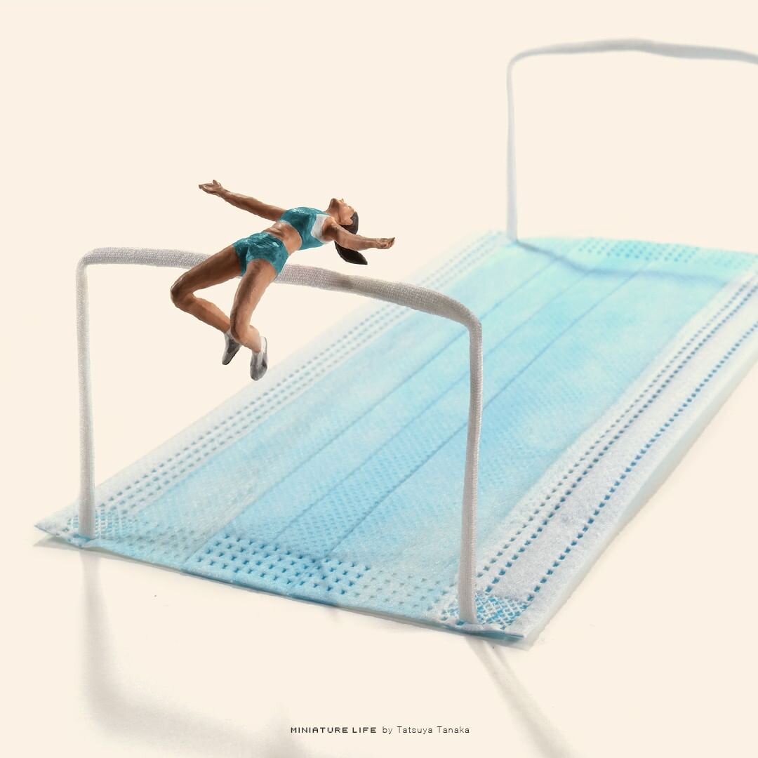
Tatsuya Tanaka – Tokyo 2020
Tatsuya Tanaka is a Japanese miniature and mitate artist who explores everyday life scenarios. What makes his art so unique is his novel use of common household objects such as toilet paper rolls, cartons of eggs, fruit and veg, sugar cubes, the list goes on.
Everyday since 2011, Tatsuya has been adding to his ‘Miniature Calendar’ series by creating mini landscapes using these common objects, while photographing them and uploading the end results to his social media. He has gathered quite a following, with his Instagram account having a whopping 3.1 million followers.
A more recent project is his piece “Tokyo 2020”, where he has recreated Olympic events using face masks and household items. Tanaka cleverly used medical face masks to represent different surfaces and equipment you’re likely to see at the Olympic Games. In one piece, he turns a blue mask into a swimming pool by lining up tiny swimmer figurines posed to look as though they’re about to dive in. What I love most about this artwork is his ability to take a challenging situation being experienced all over the world and convey it through art, hopefully bringing a smile to those who need it most.

28/01/2021
Image courtesy of Denomination
Denomination’s ‘Ouvo’ – Wine packaging that breaks every branding convention.
There is more to someone (or a wine bottle) than meets the eye. A wine label for some people (probably most), is just a pretty picture stuck on a bottle. But it can completely change people’s perception of the wine, even the taste! Denomination’s ‘Ouvo’ label breaks almost every branding convention, and that’s why I love it.
The simplicity of the label is astonishing. The creative team’s insight was born when three hulking ‘egg’ tanks were delivered to Larry Cherubino’s winery. The originality can be seen in the warm white egg-shelled textured paper, and the lack of graphics on the label perfectly represents the authentic winemaking process. To add to this, the shape alone and the egg carton packaging is like no other and a unique identifier.
Larry Cherubino said “consumers love the packaging, then they taste the wine, and it all ties together… the pack, the method, the wine. It’s so simple but effective” – This sums it up perfectly.
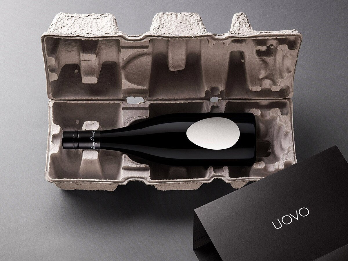
Image courtesy of Denomination
23/10/2020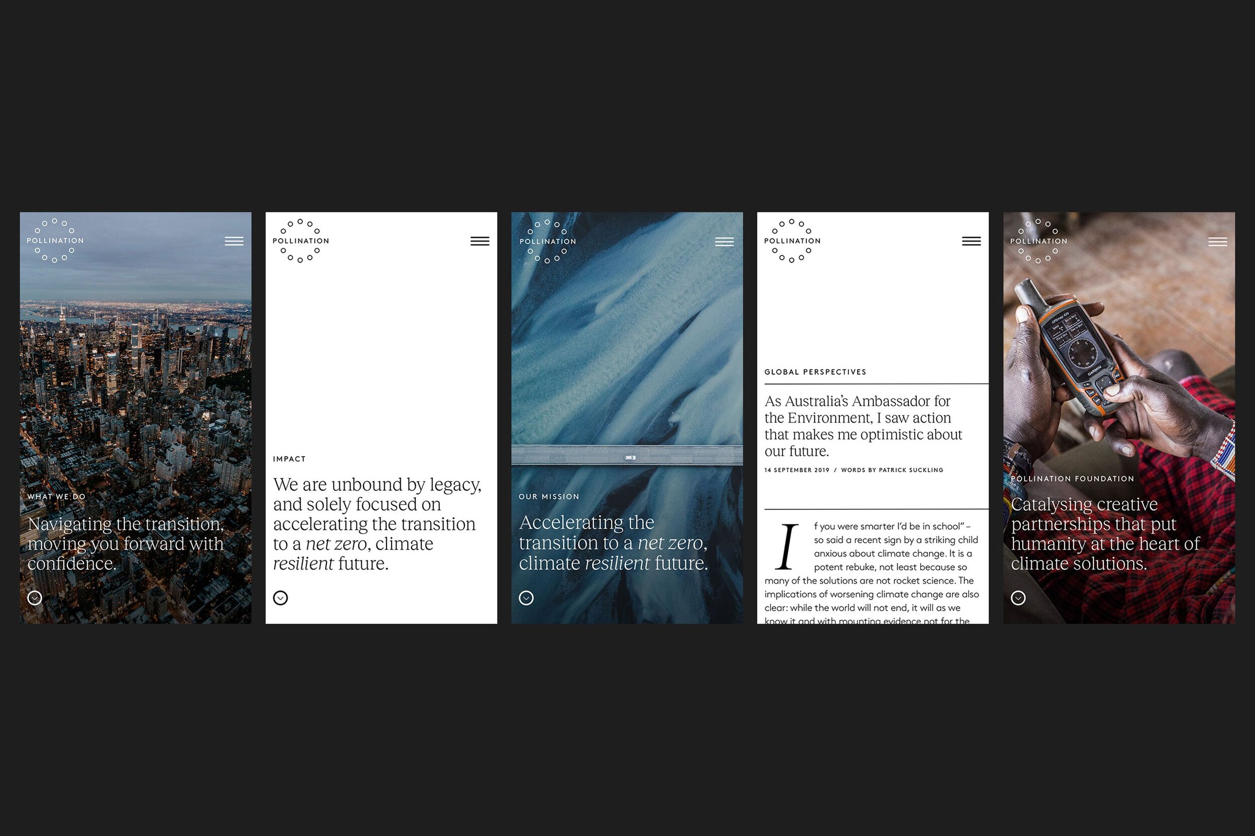
Image courtesy of Frost*collective
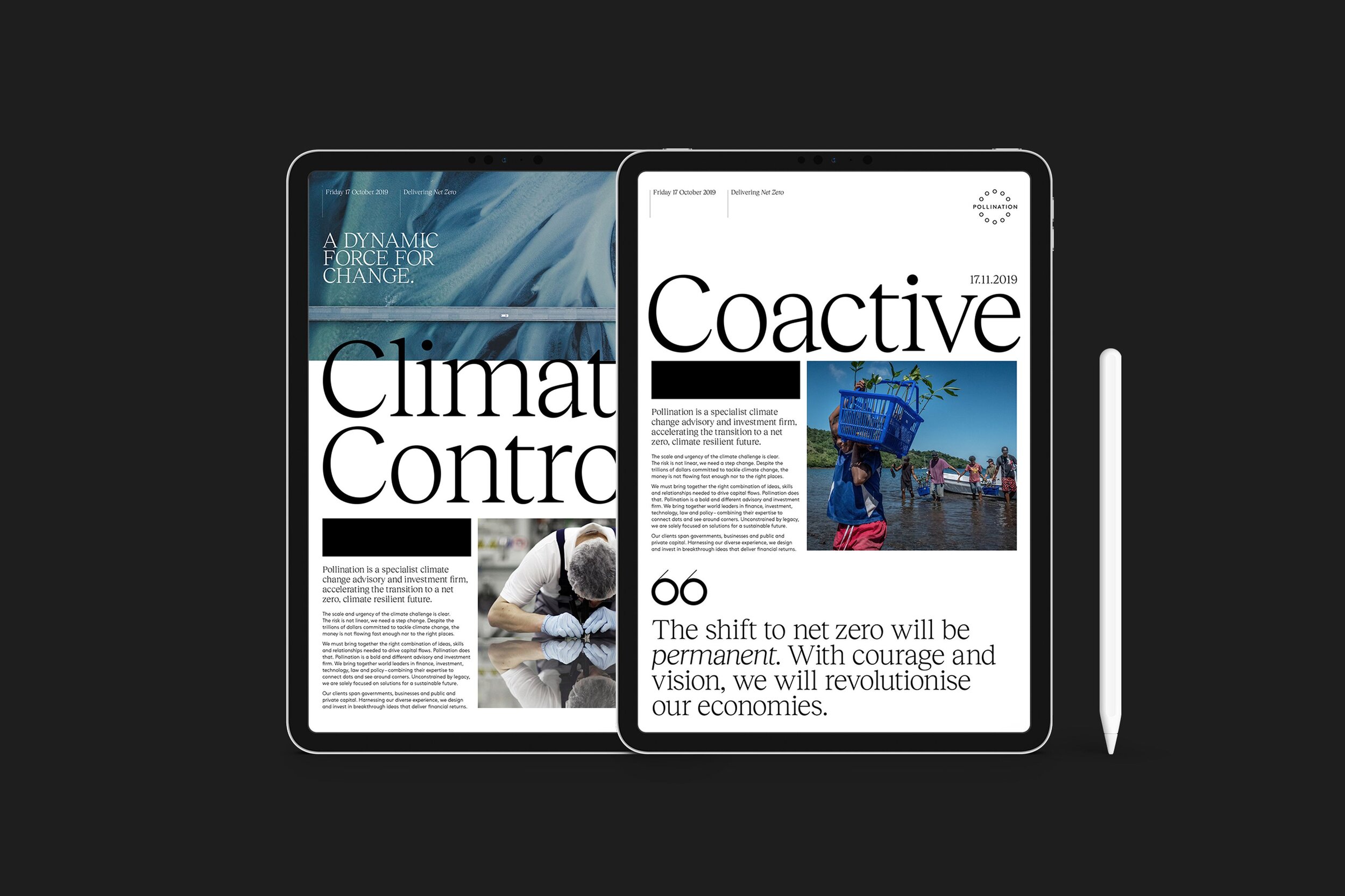
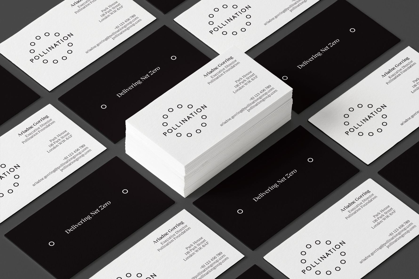
Frost Collective’s ‘Delivering Net Zero’. A brand launch
for Pollination (a global investment and advisory firm with a single purpose: accelerating the transition to a net zero, climate resilient future).
Talking about climate change isn’t easy. Large business organisations and governments are aware that defying solutions are rapidly needed, but many choose to ignore it. The way forward can sometimes be unclear, Pollination are a global investment and advisory firm that have a purpose to accelerate the transition to a net zero, climate resilient future. What I enjoy most about this campaign is the meaning and drive behind it. Pollination are big-picture thinkers, driven to get the ball rolling. Frost Collective had a vision to launch an identity for Pollination, based on working collectively towards a net zero carbon emissions future.
Technically, the branding aims to drive the net zero campaign even further. The black and white colour palette highlights that climate change shouldn’t be a grey area. The circular, zero looking graphics within the logo are a nice way of conveying their mission. Photographic direction is something that can be easily overlooked when designing for a brand, although in this case it champions the role of Pollination which can be seen at the centre of the climate change story – to show the bigger picture.
Images courtesy of Frost*collective
28/09/2020
Image courtesy of Turner Duckworth
Turner Duckworth's 'Breaking the chain' - A creatively driven system to support EJI's (Equal Justice Initiative) message in a bold and exposed way.
Hey! I’m Nic, Freckle’s new(ish) junior graphic designer. I am creatively driven and a bit of a design geek. One aspect that fascinates me about design is the ability to combine creative talent to artistically problem-solve. This particular campaign is one I have recently drawn inspiration from.
Having had the privilege to meet Bruce Duckworth, I know he aims to design for purpose and that is what is so admirable. Due to recent events (Black Lives Matter movement), this campaign stood out for me in support of EJI. It highlights the challenging racial and economic injustice. The campaign acknowledges the protection of basic human rights for those who are most vulnerable in American society.
Technically, the artwork is strong and loud. The branding contains bold fonts, backed up with a powerful black and red colour pallet. The print collateral is simple, clean and importantly lets the message of EJI be told.
Image courtesy of Turner Duckworth
Strategically, this campaign is outstanding. The broken chain logo accompanied with slogans such as "justice for all” and “slavery didn’t end in 1865, it evolved”, I believe represents EJI's commitment to ending mass incarceration and excessive punishment in the United States. Turner Duckworth has created a powerful visual identity to support a humanitarian non-profit organisation.