Freckle News

Interview with a Freckle: Chris Low

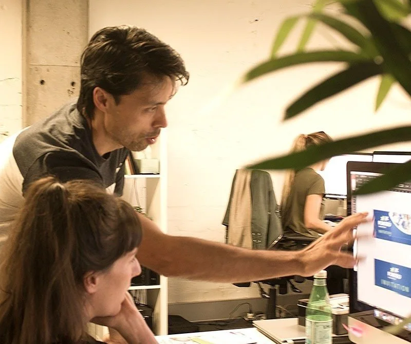
This month, we're celebrating our Creative Director, Chris Low’s 15th year at Freckle. We took some time out to find out a little more about what makes him tick.

What do you tell people you do at awkward speed networking events?

I’m a visual designer. I love using those skills to solving problems, not just make art. In my spare time, I like to be in places with little-to-no mobile reception.

What are your greatest strengths and ‘quirknesses’?

I have a very long attention span. Once I’m invested in something, I give it 100%.
My quirknesses? Instead of sleeping in on the weekend, I will happily be up before sunrise to go hit a tiny white ball around a large green field. I also tend to go on holidays that require a holiday to get over.

Who aren’t you?

I’m not wasteful. It drives me nuts to see anything go to waste, when it can be reused, repurposed, reinvented or even reheated!

What drew you into the creative industry in the first place?

I’ve loved drawing and making things since I was a kid, so I feel like I was always going to end up in a design-related field. I still enjoy stepping away from the keyboard and putting pencil to paper as much as I can.

Over the 15 years of working at Freckle, what has been your biggest takeaway? Your proudest moment?

I’m most proud of the relationships we have built with suppliers and clients over the last 15 years. That we have sustained such long-term bonds is a credit to every freckle alumni and it’s the secret to our collective success.

Where do you see yourself in 5 minutes? 5 Days?

5 minutes? Falling asleep on the couch. 5 days, continuing to work with a great bunch of design and communication professionals and delivering for our clients.

What’s one piece of advice you would give to young designers?

Listen before you speak. Be decisive. And ‘because it looks nice’ isn’t a good enough reason for a design decision.

What could Freckle clients ask you about, that you could expertly talk about for three hours?

The importance of living up to your brand values, the intricacies of design and production, why I loathe Microsoft Outlook, and of course, the next creative conundrum you need me to help solve!

Interview with a Freckle: Johnny Le

Johnny is the newest member of the Freckle team. 
 
  
  96


  Normal
  0


  false
  false
  false
  
  EN-GB
  X-NONE
  X-NONE
  
   
 &nb…

June marks Johnny’s fourth year at Freckle! This month, we’ve sat down/rode alongside out talented senior designer, for a well deserved chin-wag about all things design and life.

What do you tell people you do at awkward speed networking events?

I’m a visual communicator that specialises in branding, print and digital design who also knows my way around a camera. Outside of this, you’d probably find me on a bike, in a cafe or cooking in the kitchen.

Congratulations on your recent promotion to senior designer! What does this title change mean to you?

To be honest, day-to-day nothing has changed too drastically. But that being said, being a senior designer means that I can have the opportunity to be involved in projects at a higher level, from brief to finished art.  

What are your greatest strengths and ‘quirknesses’?

I’m a naturally curious person who’s always looking for new and exciting things. I enjoy the experimenting in my design process, finding new approaches to create something unique. My quirkiness would have to be my absolute hate of velcro, it’s the nails on the blackboard for me.

What’s the biggest creative challenge you have overcome recently?

I’ve recently started redesigning my local bike shop’s website. The initial brief was, well…brief… somewhere along the lines of “keep it simple” and “make it work”. But, by asking the right questions (something I learnt more about in our recent Freckle Development Day), I was able to put together a more comprehensive brief that really helped define exactly what the shop needed.

Everyone has a good app idea, what's yours?

Sometimes I find myself in a “Ready, Steady Cook” situation at home, where I have a bunch of random ingredients and no idea what to make with them. My idea would be to enter those ingredients into the app, which would then come up with some recipes base off those ingredients. It’ll be a great way to save food and money. 

What could Freckle clients ask you about, that you could expertly talk about for three hours?

I could probably talk my head off for hours on the different types of paper stocks, print finishes and print production processes. I’m a big fan of tactility in design and how it can be used to create a deeper connection to a visual concept.

What’s your favourite thing about print?

I’m a tactile person, so I like how print can engage your senses, especially touch and smell (nothing like the smell of freshly printed ink). 

From a designer’s perspective, I like the challenge of trying to tell a story with information in a limited space or format, taking into consideration things like folds and spaces.  

What food couldn’t you live without?

My mum’s chicken pho! Also croissants.

What will your ‘Freckfest’ talk be titled?

I’d call my Freckfast Talk “Connecting in a connected world”. In a world connected by social media, I’ve noticed that we’ve become distant in our face to face social interactions and have increasingly become socially isolated. So I want to explore ways we can get that face-to-face social interaction back.

Meet Tiffany

This month we're turning the spotlight on our founder & director, Tiffany Partington. Tiff candidly answers a few of our questions on design and life.

When did you start Freckle?

17 years ago!

Who’s your biggest inspiration?

I’m inspired by people who aspire to achieve more in their communities and those who pay it forward. They energise me to do what I love – working in teams, sharing ideas, creating networks and communicating with people on behalf of brands. It’s a real privilege and very emotionally rewarding!

Any advice for young creatives?

Share your S.M.A.R.T. goals and never stop reading or listening to stories that resonate.

What’s your go-to-brekky?

A bowl of power porridge with sliced banana, blueberries, rhubarb, ginger compote, and toasted coconut flakes. A homemade fruit smoothie with protein powder is my back-up brekky.

What was your lockdown strategy?

I listened to and appreciated the people around me. At every opportunity I amplified their amazing achievements and acts of resilience. It was the spirit of community that kept me positive.

Do you have a goal for 2022?

This year I’m focused on keeping a schedule, so I can balance my time and allow myself to plan ahead, and to achieve goals that have a positive influence on the future of my community.

Nic's Picks

17/08/2021

Tatsuya Tanaka – Tokyo 2020

Tatsuya Tanaka is a Japanese miniature and mitate artist who explores everyday life scenarios. What makes his art so unique is his novel use of common household objects such as toilet paper rolls, cartons of eggs, fruit and veg, sugar cubes, the list goes on.

Everyday since 2011, Tatsuya has been adding to his ‘Miniature Calendar’ series by creating mini landscapes using these common objects, while photographing them and uploading the end results to his social media. He has gathered quite a following, with his Instagram account having a whopping 3.1 million followers.   

A more recent project is his piece “Tokyo 2020”, where he has recreated Olympic events using face masks and household items. Tanaka cleverly used medical face masks to represent different surfaces and equipment you’re likely to see at the Olympic Games. In one piece, he turns a blue mask into a swimming pool by lining up tiny swimmer figurines posed to look as though they’re about to dive in. What I love most about this artwork is his ability to take a challenging situation being experienced all over the world and convey it through art, hopefully bringing a smile to those who need it most.

221847103-208490977746022-9096366775004504139-n_f876.jpeg
 
28/01/2021
Image courtesy of Denomination

Image courtesy of Denomination

Denomination’s ‘Ouvo’ – Wine packaging that breaks every branding convention.

There is more to someone (or a wine bottle) than meets the eye. A wine label for some people (probably most), is just a pretty picture stuck on a bottle. But it can completely change people’s perception of the wine, even the taste! Denomination’s ‘Ouvo’ label breaks almost every branding convention, and that’s why I love it.

The simplicity of the label is astonishing. The creative team’s insight was born when three hulking ‘egg’ tanks were delivered to Larry Cherubino’s winery. The originality can be seen in the warm white egg-shelled textured paper, and the lack of graphics on the label perfectly represents the authentic winemaking process. To add to this, the shape alone and the egg carton packaging is like no other and a unique identifier.

Larry Cherubino said “consumers love the packaging, then they taste the wine, and it all ties together… the pack, the method, the wine. It’s so simple but effective” – This sums it up perfectly.

Image courtesy of Denomination

Image courtesy of Denomination

 
23/10/2020
Image courtesy of Frost*collective

Image courtesy of Frost*collective

Frost Collective’s ‘Delivering Net Zero’. A brand launch
for Pollination (a global investment and advisory firm with a single purpose: accelerating the transition to a net zero, climate resilient future). 

Talking about climate change isn’t easy. Large business organisations and governments are aware that defying solutions are rapidly needed, but many choose to ignore it. The way forward can sometimes be unclear, Pollination are a global investment and advisory firm that have a purpose to accelerate the transition to a net zero, climate resilient future. What I enjoy most about this campaign is the meaning and drive behind it. Pollination are big-picture thinkers, driven to get the ball rolling. Frost Collective had a vision to launch an identity for Pollination, based on working collectively towards a net zero carbon emissions future.

Technically, the branding aims to drive the net zero campaign even further. The black and white colour palette highlights that climate change shouldn’t be a grey area. The circular, zero looking graphics within the logo are a nice way of conveying their mission. Photographic direction is something that can be easily overlooked when designing for a brand, although in this case it champions the role of Pollination which can be seen at the centre of the climate change story – to show the bigger picture.

Images courtesy of Frost*collective

 
28/09/2020

Image courtesy of Turner Duckworth

Turner Duckworth's 'Breaking the chain' - A creatively driven system to support EJI's (Equal Justice Initiative) message in a bold and exposed way.

Hey! I’m Nic, Freckle’s new(ish) junior graphic designer. I am creatively driven and a bit of a design geek. One aspect that fascinates me about design is the ability to combine creative talent to artistically problem-solve. This particular campaign is one I have recently drawn inspiration from.

Having had the privilege to meet Bruce Duckworth, I know he aims to design for purpose and that is what is so admirable. Due to recent events (Black Lives Matter movement), this campaign stood out for me in support of EJI. It highlights the challenging racial and economic injustice. The campaign acknowledges the protection of basic human rights for those who are most vulnerable in American society.

Technically, the artwork is strong and loud. The branding contains bold fonts, backed up with a powerful black and red colour pallet. The print collateral is simple, clean and importantly lets the message of EJI be told.

Image courtesy of Turner Duckworth

Image courtesy of Turner Duckworth

Strategically, this campaign is outstanding. The broken chain logo accompanied with slogans such as "justice for all” and “slavery didn’t end in 1865, it evolved”, I believe represents EJI's commitment to ending mass incarceration and excessive punishment in the United States. Turner Duckworth has created a powerful visual identity to support a humanitarian non-profit organisation.